Tuesday, February 28, 2012

Artists


A few arts have recently caught my attention. The first is Victor Nizovtsev a painter of fables and mermeids. I found his use of rich color to create reflection really beautiful.


Another artist I found was Stephen Wiltshire. He draws large cityscapes from almost no refernece by relying on his memory. This is a link to his gallery.
http://www.stephenwiltshire.co.uk/gallery.aspx

Post 6


This if the final to the piece based on Vermeer's Procuress and a few or my rough studies. The concept of the piece is that women are cultivated and sold, like land, reflecting the focus of the prostitute being planted in the ground as a seed.


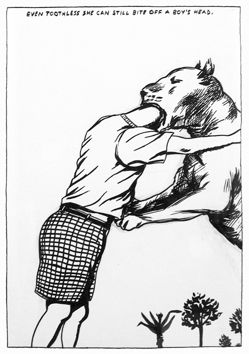
This is my weekly drawing that I may have been a little too invested in. I really love drawing in high detail with ink as well as inventing characters and clothing.

Jon post 6

project in response to Caravaggio's  "The Musicians"

                                                                "Olney -Erie -69th "
                                                                      31x45


Sewing is something that I learned from my mother and grandmother and has been apart of my direct families craft tradition. When I was younger I use to make toys and characters out of material which makes this medium have a sentimental value to me along with the meaning of embroidery and soft sculpture history normally popularized by women. With that understanding playing off of the associations of gender with the artistic medium and I being a gay male I generate that conversation personally in conversation with myself the artist as well as the male form portrayed in "poses". The objects for me are the clothing which draws on contemporary fashion styles of men . In our modern culture more men are becoming aware of their appearance homosexual or straight and from different cultures and social classes. Body art and drawing "tattoos" have become apart of our societies cultural movement as well along with body piercing within its self having social and cultural significance in history .

The formal qualities that Constitute as a drawing for me involved line weight pattern and texture which I've used here. I am confident this is a medium I will continue to draw in and explore in the future. Size doesn't scare me and I'm also use to it if anything smaller things make me uneasy I feel limited.I'm from Philadelphia and have lived here all my life the title speaks to places in Philly that have grown to know as popular places and where I see many men stylishly making their way around the city. Fitted hats and scarves along with glasses and body art are so frequently seen as I commute and socialize in the city and within my neighborhoods. 

Monday, February 27, 2012

Jason Moorer - Post 7: Ryan Shultz, Daily Drawing and "Study for the Final"


I made a collage of this drawing that is too big to upload. It is a continuation of a series (if you will) that deals with interior spaces and their relationship to its inhabitants. The figure is a member of a pop/punk band who is wearing an American Flag with a dollar sign on his chest. He is juxtaposed in a colonial living room, with a rocking chair. The text in the image reads “AND SO, MY FELLOW AMAERICANS: ASK NOT WHAT YOUR COUNTRY CAN DO FOR YOU- ASK WHAT YOU CAN DO FOR YOUR COUNTRY” I liked the contrast of sentiment as well as the idea that patriotism is something I feel that is convoluted. I honestly feel like this hipster if he were in the streets when this statement was said would not be viewed as a positive thing. I don’t know, it’s something interesting to analyze what we deem as All-American and what is the All-American type of household etc…


I came across Ryan Shultz’s work on GawkerArtist.com. His works deal with primarily youth culture and what he calls the “cult of excess:” with depictions of scenes of intoxication, drug usage and alienation. He borrows elements of historical and classical paintings like compositional devices. He is influenced by popular culture as well. I like the documentation of culture to express a universal concept. I like that he references old masters while still doing something contemporary. I often like using subjects, especially figures from my own culture and placing them or referencing them in different, historical settings.

RyanShultz.com


Here is my "Study for the Final" Drawing, entitled, (at the moment) "PARADISE: EXOTICA" Sorry for the bad quality picture.


Jason Moorer - Post 6: Response to Text Reading

The reading was incredibly informative. I already recognized the mixed media and inter medial relationships concerning text usage in artworks. I am most fond of Raymond Pettibon’s usage of text because I feel like joins the two elements rather than treating text and image as two separate entities. I think the integration and coherence requires the reader to analyze the work as a whole rather than piece-by-piece. I mostly agreed with this statement: “ In the mass media and in art there has been a strong impulse to extend notions of the inter-medial by breaking down the boundaries between the various media in radical ways.” (14) The writer continues, “This generally involves the integration of diverse spaces, movements and sounds.” (14) I think the dilemma artist face is not having the forces, text and image in some sort of conflict. I also agreed with Clement Greenberg’s assessment that, “the goal towards painting was the articulation of a purely optical experience.” (16) He continues, “[text] stopped the eye at the literal, physical surface of the canvas the same way that an artist’s signature did.” (16)

In my opinion, I think it is the human’s relationship with text and words that ultimately affects our evaluation of artworks that incorporate this element. Text has always been taught to us as something to be read and comprehended and not an aesthetic experience; thus when we see text in a painting, our immediate knee-jerk reaction is to read the text and not look at the artistic qualities that the text may contain. This is not necessarily a bad thing but it is interesting. Let’s say if I saw a language like Chinese, which is composed of characters and mark making; since I’ve never been required to read and understand Chinese, I do not immediately recognize it and interpret it as text to be comprehended, so I look for other qualities about the text to analyze. It doesn’t become text anymore, it becomes something like an optical experience and this is where I am in conflict with Greenberg’s assessment.

Sunday, February 26, 2012

Lauren, Post Six.

This week I have sketched a hand with elephantiasis. Deformities and disfigurations are obviously something of interest to me. As of late I have started to think about my childhood interest in family trees. I would make up genealogy for my barbies and lengthy lists of names and birth dates  in preparation for playing "pioneer girl" or "indian girl". I have recently started to put deformities and family history together in context of inbreeding and think that it already played a role in my work without me truly realizing. 


Chet Zar


Born in 1967 in San Pedro, Ca. Like most of us he spent his childhood drawing and painting.
"A natural fascination with all things strange fostered within himself a deep connection to horror movies and dark imagery. He could relate to the feelings of fear, anxiety and isolation that they conveyed. These are themes which had permeated most of his childhood drawings and paintings and are reflected in his work to this day." 
He works as a special effects make up artist, designer and sculptor for movies, along with painting. 


This is my "Study for the Final" 


"Watch your purse and ya tits"

Wednesday, February 22, 2012

Textual Healing

I came across this really great site developed for the exhibition Art=Text=Art at the Richmond University Museum. In addition to a good introductory essay there are essays and representative images for each of the 60 or so artists involved. All, as you might expect, deal with text or the verbal in some way, shape, or form, particularly through drawing and works on paper.

Dig in! Click the link here.


Something that was both funny and interesting..

Shit Art world people say -----linkage to video
I know everyone is in the know about the Memes and videos about "shit____says" well there is an art one now. That I thought was funny and worth sharing along with whatever else is on the site that I discovered on my facebook  News feed.

http://hyperallergic.com/46166/shit-art-world-people-say/  --- this is where I found information about the video

This is the website where the the people who made the video came from--- http://www.creativetime.org/home

Tuesday, February 21, 2012

Heather-Post 5


The first image is a drawing I'm in the proscess of inking. It's just something fun and personal, inspired by the Celtic goddess Brigid, goddess of fire and spring. The second is a response to the reading in a rough sketch form, the text is an Einstein quote that reads: Everyone is a genius. But if you judge a fish by its ability to climb a tree, it will spend its whole life believeing that it is stupid.

Mariel IV

Thought I would share my initial figure/prop photo shoot for our Drawings for the Finals projects. Cat, book, wine glass, ipod (somewhere), and mirror included. 


And then there was some fun. 


Ultimately I think I was able to capture some moments of a contemporary home lifestyle in order to depict in the new piece. The last two pieces are studies I did for the self portrait portion of final. 


Drawing post/reading response


This is a tattoo design for a friend of mine. It's roughly sketched but the one drawing I've done this week.

In this post I'd like to also put my reading response;
While doing the reading, I came across the name Raymond Pettibon I looked up his work and I got a better grasp of what it was I was suppose to get out of this reading.

Monday, February 20, 2012

Ben post 5


These are two studies for the final project. I'm working with Caravaggio's "Young Bacchus" who is titled as the Roman god of wine, so a majority of my subject matter is going to involve wine, grapes, and other wine traits. The first picture is a drawing of wine being poured into a glass that i referenced from the internet. I like the texture from the splashing of the wine and i plan on developing that further in my final drawing. The second picture is of a cluster of grapes..Yeah, that's all i got to say about them grapes.

Sara: Post V

One thing I love about the city is that you can see into other people's homes so easily. Creepy, yes, but I like watching people when they have no idea they're being watched, that way they're being their whole selves, you can really get inside their heads. This is the view out of my bedroom window. I've never actually met these neighbors and I only kind of see them when they throw the dog or the garbage outside or when they stand in their kitchen staring into the refrigerator. I wouldn't be able to pick them out in a line up, but I feel like I know them... they're mysterious. In a way, these apartments are like portraits of the neighbors whose faces I've never seen and I enjoy drawing them.
Andrew Wyeth is my favorite artist and the reason I mention him now is because I think he is successful in bringing life to the inanimate objects (from houses and boats to tin cans and fruit) in his paintings and drawings. I think the amount of detail in his work shows the care and attention he gives to each object and it makes the viewer wonder why it deserved so much attention. In this painting for example, it seems to me like it is a portrait; whether it's a portrait of the house or of someone else is a mystery, and that's what keeps my drawn to his work. He often said that he viewed his own work as abstract and that realism was just his style.


Thoughts on Writing on the Wall:

I found this article interesting because I never gave the relationship between image and text much thought, or verbal and visual. Discussing how the invention of the alphabet changed transformed writing from pictorial to non-pictorial, then separating the acts of perception and conception and later relating them back to one another by saying that "writing is indeed visual language, that is, it is something which appeals to the eye as well as to the mind" is what I found most important.


Gerhard Richter

The NY Times has a brief article about the reception of painter Gerhard Richter in his native Germany. As painting students, you should be familiar with his difficult-to-classify work and its critical importance. Click here.


                                         another sketch i was messing around with just another tattoo design i created from the top of my head with the help of some references still with the native vibe with the dream catcher and the wolf. done with pencil and pen on sketch pad

Sunday, February 19, 2012

Jon post 5

Currently in progress this is a continuation of human condition exploring the loneliness individuals are unable to disconnect from. The exploration of the individual’s engagement with another and the dangers of emotional and physical vulnerability exposing ones stark nakedness to another, an energy that is often uncomfortable and difficult to ward off due to the human condition. The moment of openness is a moment of risk and frailty inviting desired nourishment however unarmed and accessible for pain. The study for this painting was worked from several photos more so with deciding upon the plastic bags around the head. 
I've been dealing with plastic and trash bags off and on with a few drawings and paintings and I stumbled across this artist who blew me away. I'm not easily impressed with it comes to photo rendered work usually because I doesn't really seem unique to me when I look at it and it takes a lot for it to stick out to me I guess aesthetically. Melissa Cooke is a recent artist whose been working in graphite beautifully rendering highly emotive subjects which is something else that's important to me, emotion.   She works in series which is something that I have been doing in my own work which brings me closer to my work.
all of her work can be seen here Melissa Cooke


To the right is a painting I did last semester titled "paper or plastic"


The article on image and text was very interesting. It make me think of some of the devices and theory that Graphic designers encounter and express through there work. The craft arts or prior known as the "lesser" arts functioned in a mass produced mode in society artists such as louis lautrec who was known for his fine painting influences through his promotional posters with guesteral qualities and alphonse mucha used type faces and image together in a interesting and effective visual experience which are important devices in Graphic design works. I thought the implied hierarchy between image and text where one holds more value or functions more in a piece is rather interesting I think in terms of phrases and cultural influences and how value the image or text is to a particular individual or group of people.

Lauren Post 5


This week I chose to experiment with the medium I plan to use for my interpretation of the vermeer painting, The Procuress, while showing an expression similar to what I intend to use for the final piece. I am changing the context of the painting and adding a goofy twist. Things that are purposeful in the painting will be accidents, expression will have more emotion (and also more than what I drew for this week), and the composition will be mimicked. I plan to reverse the layering process that I have done here in order to get warm highlights instead of cool and to add other colors in some areas to reference the painting. 


Golucho (Miguel Angel May) 


http://www.golucho.com/


Golucho was born in Madrid in 1949
He studied in Paris
Well known in Spain and has shown in Philadelphia and New York ( and many places in Europe)
I love his use of texture, the way he depicts wrinkles, and mainly his craftsmanship.